
Leanne Garner Massage Therapy | Pilates Logo Development
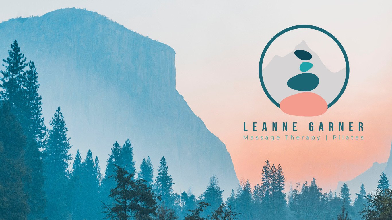
Leanne approached me to develop a new logo that would represent her businesses and reflect her love of the outdoors, Mountains and in particular the Himalayas . Taking influence from Leanne’s original logos I combined some of her existing brand colours to create a new palette and a fresh look whilst keep some familiarity. Set in front of the Everest silhouette I developed Cains/stones icon representing balance and the physical and mental health benefits Leanne’s services can bring to her clients.

Services Provided
Logo Design Development